

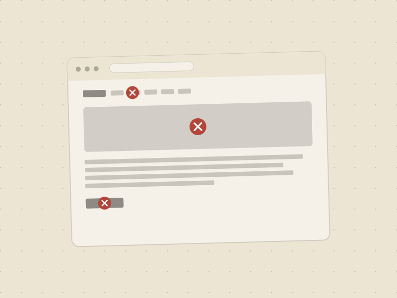
We've looked at a lot of vet clinic websites while building Vetfluence — not client work, just the ordinary process of understanding what's already out there before building something better. The patterns repeat constantly, on clinics with three-figure budgets and clinics with five-figure ones alike. Here's what shows up most, in no particular order except roughly how often we see it.
The stock photo hero
A generic photo of a golden retriever at a groomer, or a stethoscope laid across a clipboard, tells a visitor nothing about your specific clinic. It's the exact opposite of a trust signal — it reads as "we didn't have a real photo," which is a strange thing to accidentally communicate to someone deciding whether to trust you with their pet. A real photo of a real vet with a real animal, even a phone photo, beats a polished stock image every time.
Hours buried three clicks deep
An anxious visitor's first question is almost always "are you open right now." When that answer lives on a separate Contact page, behind a nav click, instead of in the header or the very top of the homepage, the site has failed its most time-sensitive visitor before they've read a word of the actual content.
Five tabs, no clear order
Home, About, Services, Team, Blog, Testimonials, Contact — a flat list of seven-plus nav items with no priority signals asks a worried visitor to guess where the answer they need is hiding. A shorter, deliberately ordered nav (with the practical stuff — services, hours, booking — ahead of the storytelling stuff) does more work than any individual page redesign.
A worried pet owner isn't browsing your site's structure. They're trying to find one specific answer as fast as possible — and every extra tab is one more place it might not be.
One CTA, and it's just a phone number
A phone number in the header is good. A phone number that's the only way to take action is a missed opportunity — some visitors want to book online at 11pm without talking to anyone, especially for a routine appointment. A single clear "Book Appointment" button, repeated consistently at each section, catches the visitors a phone-only site quietly loses.
Pages that take five seconds to load
Full-resolution photos dropped in unresized, autoplaying background video, three different font-loading services stacked on top of each other — most slow clinic sites aren't slow because the content is heavy, they're slow because nobody optimized what was already there. A visitor on a spotty connection, worried about their pet, is the visitor least likely to wait around for a slow page to finish loading.
None of this needs a bigger budget
Every mistake on this list is a structural or content decision, not an expensive one. A clinic with a modest site and the right priorities in the right order will out-convert a beautiful site that buries its hours and drowns its CTA in six competing nav items. Structure first, polish second — not the other way around.